At some risk of oversimplification, there are two major approaches to deciding on public art. One is that good art is good art wherever it is, in a gallery, private collection, company lobby, public space or other, and the issue of distinguishing public art from the other art and art locations is hardly significant. The alternative is that art in public spaces is qualitatively different, and this difference needs to be understood and respected.
The centrepiece of the second view is that the audience is different: most people seeing art in a public space are not seeking to see it but are passing by, while in contrast people seeing art in other locations are likely to be there intentionally for the purpose of viewing the art. The audience for public art is therefore much broader and less specialised.
That much is relatively easy to accept, but the next stage is more complex: if you are seeking public art that is both good art and widely accessible art, how do you modify good art to reflect or relate to this public art audience expecting accessibility?
A part of the answer is the selection process. While gallery and private art may represent the selection choices of an arts professional, curator or individual, the selection of public art requires a more collective and less professionally oriented process. But desirably the process will not be structured in a manner that ignores professional art input.
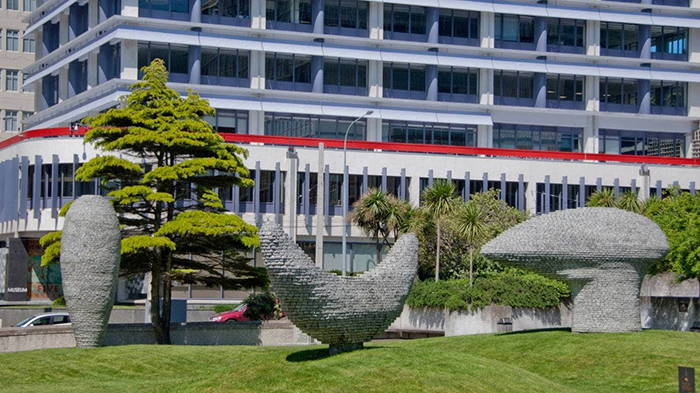
At the Wellington Sculpture Trust a two-tier system embodies this balance. There is an arts advisory panel of professional persons from the art world which advances its selections and the reasons for these, and a board of trustees who on the whole are not arts professionals but representatives of the community, passionate about art or the city landscapes in which public art is placed. While there is normally agreement between the two, the board is responsible for the final selection in each case.
Another part of the answer is to have a concept or over-arching approach to what the commissioning programme is trying to achieve with the installation of public art. It is clear in many cities around the world their ambition is to ensure popular support and engagement by commissioning what may be called populist art. This is normally figurative and literal, with examples abounding, such as of a bronze sculpture of a person sitting on a bench perhaps reading, with an empty seat beside him for viewers to sit on and be photographed. By some counts this is dumbed-down or kitsch or plonked art (depending on the writer) but for others it at least ensures there is no popular adverse reaction calling for its removal and it may do more by achieving tourist attraction status.
Wellington’s concept is rather different. The city aspires to be the nation’s art as well as its political capital and maintains high quality art forms and organisations in numerous fields such as the New Zealand Symphony Orchestra, the Royal New Zealand Ballet and the New Zealand Book Council known as Read New Zealand. It was and is logical that a collection of art in its public spaces should reinforce the standards implicit in this. That has meant not literal art but pieces with conceptual values embedded in them. The challenge this poses is demanding, for the concept and quality cannot ignore that need for public accessibility.
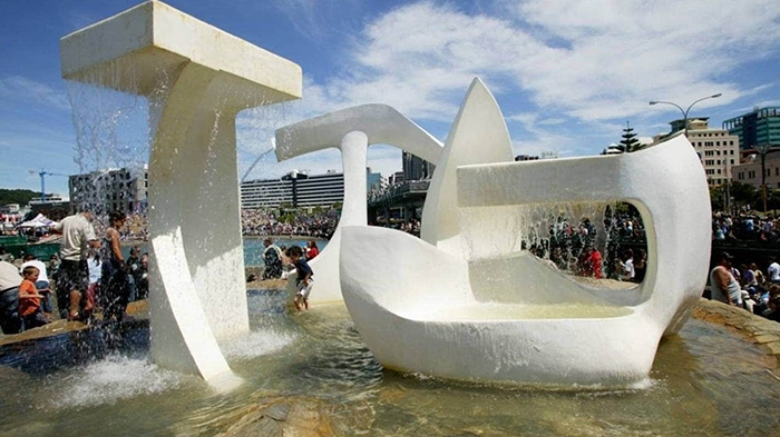
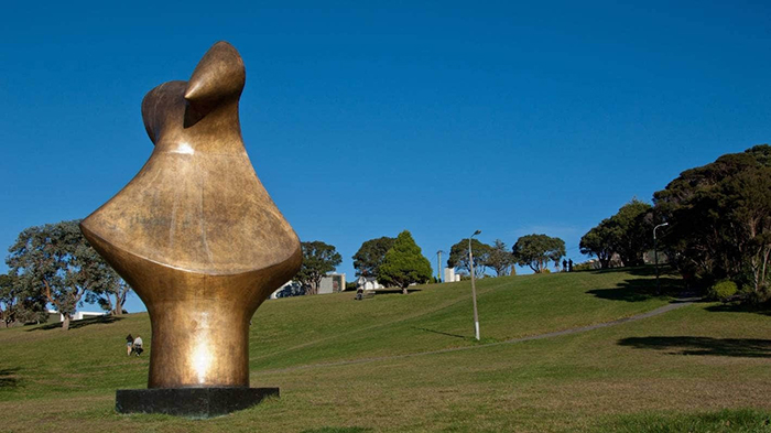
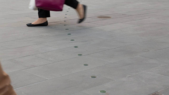
The outcome is in the sculptures themselves. One out of some 30 commissioned is close to being figurative, Virginia King’s Katherine Mansfield by Midland Park, although it is stylised and outsized compared with a standard statue. Michel Tuffery’s Nga Kina qualifies also for being literal; it is outsized and realistic if not figurative in a narrow sense. The great majority, however, are much further removed from this style. But nor are they purely abstract. Nearly all have an element of easy-to-relate-to reality in the form of, for example, braille in the case of Anton Parson’s Invisible City, earthquake movements in the case of Louise Purvis’s Seismic or a ship’s rudder in the case of Andrew Drummond’s Rudderstone.
The litmus test of whether this balance, between quality and accessibility, has been achieved or not lies in the response, and this, although largely anecdotal, suggests that in Wellington’s case appropriate selections have been made. The artworks normally have highly favourable reviews in the professional art journals and a warm enough public response in so far as this is measured through informal feedback. Some of this is uncertain rather than positive – ‘I don’t understand it but I still respect that it is there’ – but rarely is it negative.
Delving deeper into this difference between public and professional attitudes to art, there is evidence that a general public approach is influenced by an attachment to form and related features of much traditional art such as perspective, scale and colour, in contrast to the current professional view of art in which such factors play little role compared with matters of context. Modernism and post-modernism mean a lot less to a general public than to arts professionals.
Extending this, the contemporary approach of expanding the notion of what is art to include almost all of today’s culture – advertising, fashion, television, graffiti art, tattooing and so on – widens the difference between public and professional perceptions of art.
Some scientific studies offer insights into popular views of art. One suggests the preference is not straight literalism or photo-reality. It shows that most people’s brains light up most when shown an artwork which has about a 20 percent variation from reality. It seems some interpretation is expected and valued, but if you move more that 20 percent away from reality in the direction of abstraction or disguising of the object, you will lose viewer interest. It is not easy to measure 20 percent variation, but plausibly the Katherine Mansfield sculpture in Wellington, being oversize and somewhat stylised, fits this prescription, and needless to say the public feedback suggests it is among the most popular the Sculpture Trust has installed.
Another piece of research, based on the manner in which the pupils of our eyes expand when we see something appealing, such as an attractive person, and contract when we see something we view negatively, such as a shark, claims that our eyes contract when faced with abstract art.
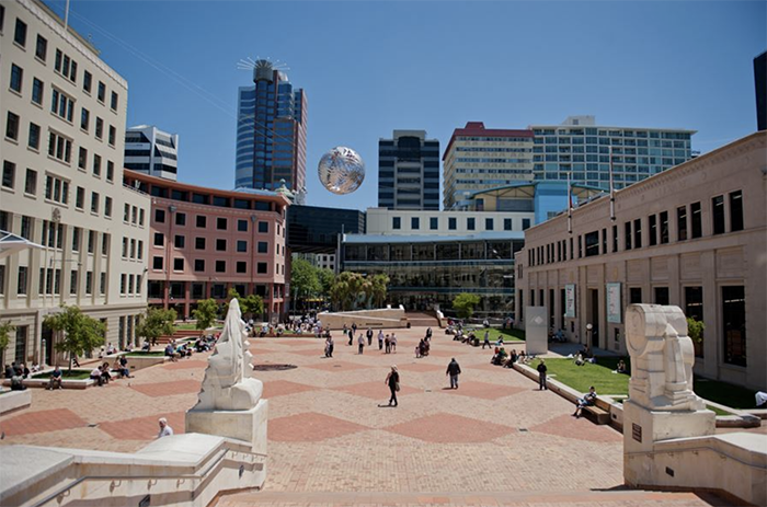
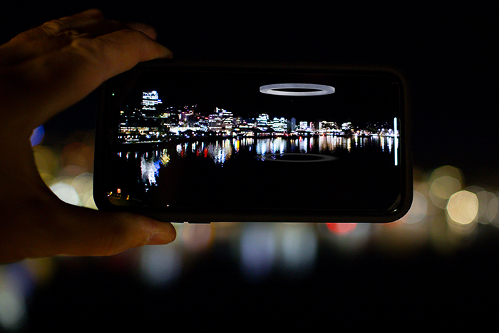
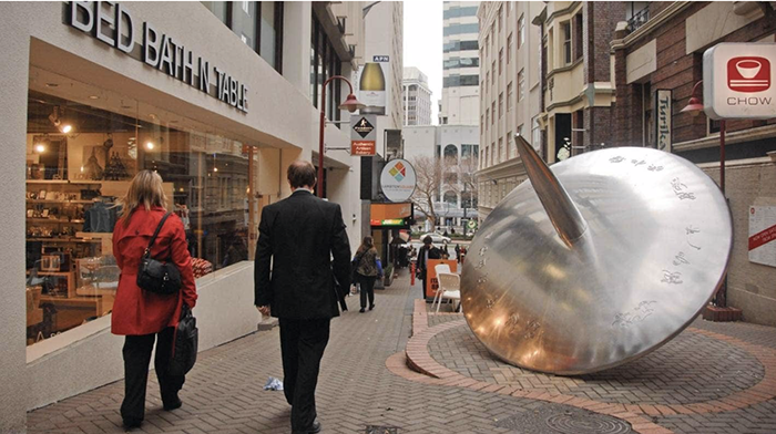
And yet another proposes that our brain uses reason and order to counter the fact of the world being subjected to increasing disorder – the second law of thermodynamics – and finds an attraction in orderly configurations particularly as found in nature, such as a spiral, a sphere or a crystal. In Wellington’s public art it is possible to see such configurations, such as the discs of Spinning Top or Seismic or the well-proportioned rectangles of Invisible City or Rudderstone, and to correlate these to wide public acceptance.
A quite separate factor, besides that of audiences and their perceptions, in identifying the difference between public and other art, relates to the outdoors location of public art. This requires intensive engineering relating to seasonality and weather, human contact including vandalism and an ability to withstand a cluttered environment (the lines of sight to many public sculptures are impeded by commercial signs, for example). These conditions require a robustness in the artwork that does not apply to art in galleries and most other private places.
This in turn has led to the development of a different type of relationship between the artist and engineers and tradesmen. It has become sufficient for the artist to conceive and design the artwork, and then contract others to construct or fabricate it. Catherine Monro’s Per Capita, made of corten steel, is a Wellington example. There may be some elements of this happening in other art, but it can hardly apply to painting and if it applies to three-dimensional indoor art it is a much less evolved relationship than for public art.
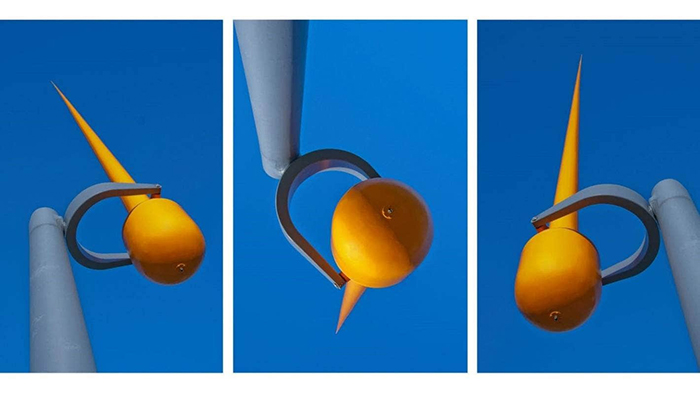
Another very practical consequence of this outdoors impact is the caution required in commissioning sculpture with moving parts. Although such pieces are desirable because of a heightened interaction with the viewer, they invariably involve much higher cost because of engineering and testing requirements – Len Lye’s Water Whirler for example had thousands of hours of testing before it was approved for installation – and also much higher levels of maintenance over the sculpture’s lifetime, and can only be installed after the most careful consideration of these factors. These requirements will rarely be manifested with indoor art.
Placing sculpture outside raises the much-debated issues of site specificity. Art inside whether two or three dimensional does not normally engage with this – a room or a wall does not impose this consideration. A painting may be unsuitable for a particular inside space, but that does not make the artwork site specific – it could be suitably placed in any number of other internal places.
There are gradations in the issue of site specificity. In Wellington’s experience the artwork in each case is deemed to be compatible with the space allocated, a good and sympathetic fit, but it is rare that a commission would be so specific to the site that it could not be contemplated to place it elsewhere. Nga Kina would be an example of tight site specificity. It is a work that necessarily is half in the water and is carefully designed and scaled for its harbourside location.
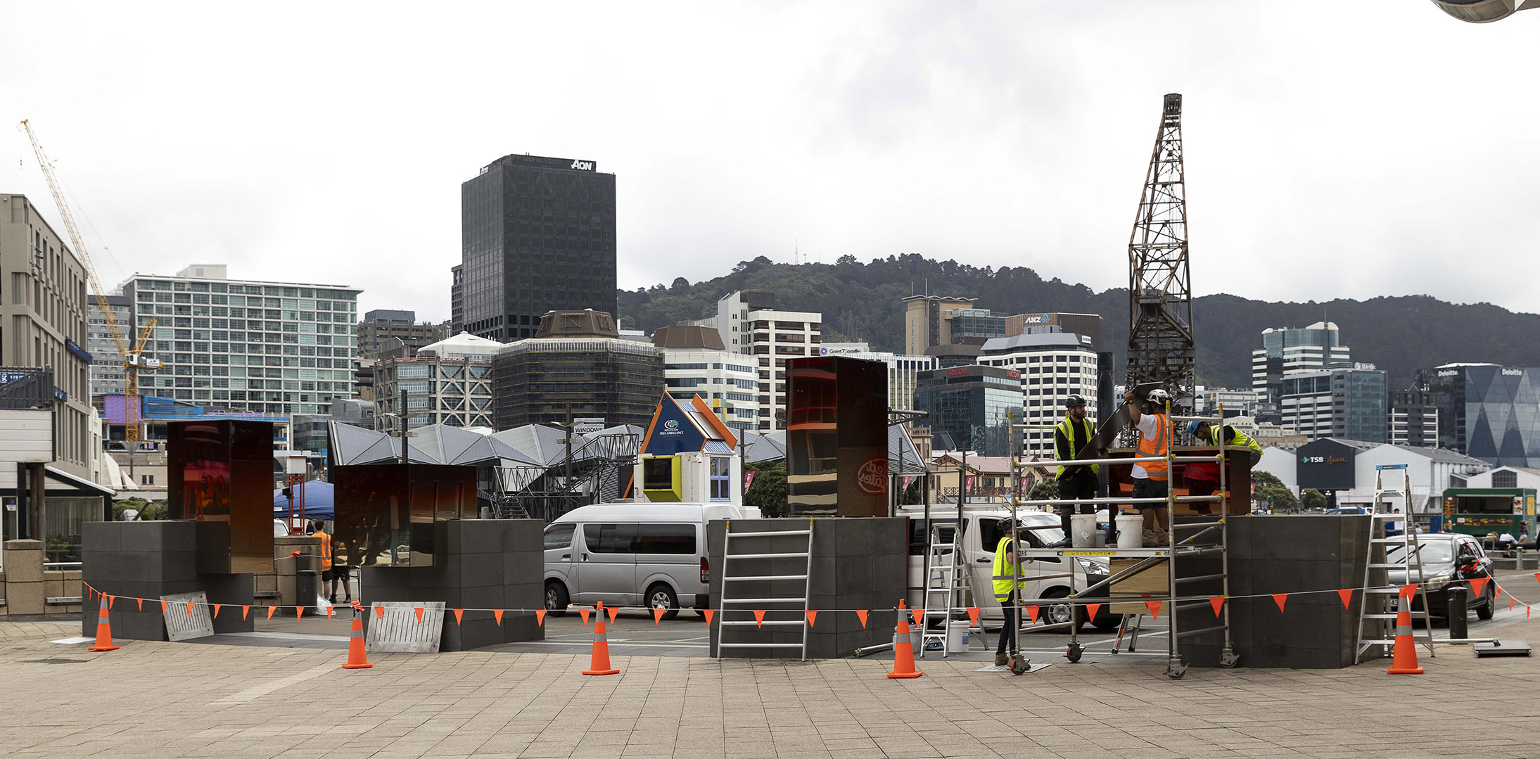
At the other extreme, Green Islands has shown how site specificity can be turned on its head. The artist contemplated the site, the four plinths outside Te Papa, and felt the over-arching feature was wide expanse of bare paved plaza surrounding the plinths and the bleak absence of vegetation. He would therefore make each plinth an island of “greenery” but added to the irony of this by designing a series of native trees made of wire. The sculpture was a striking example of an artwork chosen because of its very intense relationship to the site.
Yet the work was subsequently installed in the Botanic Garden surrounded by vegetation. This site retained the four plinths elements of the original (four replica plinths were constructed for the placement of the wire trees) but in every other respect it is hard to imagine a site more opposite from the original and the concept that underpinned the work.
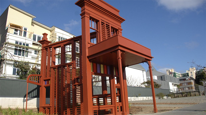
Sometimes the site does more than require the artwork to accommodate it: it may even determine the nature of the artwork. Regan Gentry’s Subject to Change is arguably a case of that. A site was chosen in a part of the city that had housed early settlers, and their Victorian homes were variously being preserved or destroyed to make way for developments. It was mandatory that the sculpture should relate to this history of the location and its buildings, and the artwork chosen achieved this both in its form and concept.
A further factor, still relating to public art’s outdoors environment, is the response of reviewers and critics. The public space siting of the art prompts them to make references that are different from their reviewing of gallery and most other art, and they do not seem to do it well. Many say, for example, that the artwork “interrogates” the space, without citing what the process of interrogation is nor the conclusions of the interrogation. The consideration of public art in its location is more understandably expressed by the language of the urban designer or landscape architect discussing, for example, scale and compatibility or contrast with surrounding features.
It is an aside to note that some of this public space critique language is spilling back into art in interiors: a recent review of an artwork comprising a piece of cloth hanging on the wall of a gallery claims that it is “articulating space” but like “interrogation” this needs elaboration to be convincing.
The selection of public art, then, requires an ongoing acceptance of significant conditionalities surrounding the viewing and physical environments of this art. At its simplest, “public” means “accessible”. Here are two other views of this that I respect. An architectural journal argues that good art is “Tough art, which does not ingratiate with accessibility or prettiness.” This is not to oppose accessibility but to require this to be achieved by means that do not ingratiate – a likely reference to that “dumbed down” art.
Another view comes from a different art form: the expatriate New Zealand composer and arts laureate Lyell Creswell was being interviewed after winning an international composition competition and was asked, “What were the organisers looking for?” He answered, “A work that pushed out the boundaries without losing accessibility.” That is such a good articulation of what good public art requires.
It is another story to describe the many areas that public and other art share. These relate to the need of both to respond to social change, the drive for diversity, greater recognition of the work of minority groups and the empowerment of marginalised people, the polarisation of political attitudes, the impact of the internet and social media, and so on.
August 2020
For more of Neil's writing see neilplimmer.net

